Summer 2026

Time limits, baking

I’m working on a fourth kind of rule: time limits. You give an app thirty minutes a day, and when they’re spent, the shield comes down until midnight. It’s only on my phone for now. Counting minutes reliably on iOS is trickier than I expected, and I’d rather let it bake.

Summer 2026

A minute to speak

Thirty seconds turned out to be shorter than people’s thoughts. Clips can now run a full minute, and rooms keep thirty of them instead of ten.

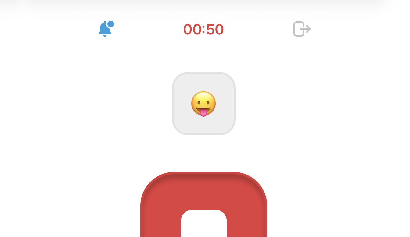
While the mic is open, the room number steps aside for a countdown, 00:44 in red, the same red as the button under your finger. When it hits zero, the clip sends instead of vanishing.

Summer 2026

Every emoji

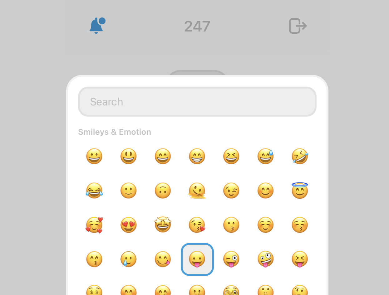
In mhm your emoji is your name, and I gave you forty to choose from. The picker now has all 1,953 of them, with a search field on top. Type “pizza” and the one you meant is the only thing left.

Summer 2026

A sound for every moment

mhm makes sounds now, which felt overdue for an app made with as little text as possible.

The mic clicks in and out around a clip. Arriving in a room plays a small chord. Clips that aren’t yours get their own note, and the three ways things can fail all share one falling tone.

Summer 2026

Opening with a wave

New rooms don’t start empty anymore. There’s a clip already waiting, a short 👋 from me explaining the basics.

It behaves like any other clip. People talk over it, it sinks, and eventually it gets pruned with everything else.

Summer 2026

Borrowed quotes

When Cactus asks you to type a quote to unlock a rule, the words used to be mine. They aren’t anymore.

I swapped them for nine lines about attention, silence, and the present moment, from Woolf, Thoreau, Pascal, Weil, Marcus Aurelius, Dillard, and Rilke. Each one is credited under the line as you type.

Summer 2026

mhm

I made another tiny thing. It’s called mhm, and it’s voice rooms for the people you actually talk to.

I built it for my kids, who are under 7, as we’re travelling separately. I wanted to experiment and see if they’d like to talk to each other directly, and what they would say.

A room is a three-digit code and a password. Inside, one big button: hold it, say your thing, let go. Your clip lands with your emoji next to it, the room keeps the last few, and everyone’s phone gets a nudge when something new arrives.

Summer 2026

Set in stone

I added a toggle called Set in stone, for the rules I know I’ll try to talk my way out of.

Flip it, save, and the rule is sealed until its end date. You can’t edit it, can’t delete it, can’t remove apps from it. Adding more is the only change allowed. Breaks still work, because a rule with no way out isn’t a rule, it’s a trap.

Summer 2026

Block a website from Safari

Cactus can now block websites, straight from the page you’re trying to escape.

Share from Safari, tap Cactus, pick a rule, done. If the rule is running, the site is blocked before you can refresh it. Share it again to remove it, unless the rule is active, in which case no. That’s the point.

If you’d rather type, the rule form takes websites directly, with a folded-away list of the usual suspects.

Summer 2026

Take a moment

I renamed emergency mode to Take a moment, which is closer to what it actually is.

While one runs, your home screen turns into a slow dawn sky. Clouds drift across, and the only thing left to press is a little “Come back” pill. If you use Reduce Motion, it all settles into a quiet cross-fade instead.

Summer 2026

Emergency mode

I’ve built a new mode. I call it emergency mode for now. I thought it’d be cool to stop the phone altogether.

Emergency mode locks everything except a few apps you choose ahead of time: Messages, Maps, whatever you actually need. One tap in.

I originally built it to only block what your rules already covered, and when I tried it on my own phone it felt broken. Everything else was still right there. So I flipped it: block it all, let a few things through.

Summer 2026

Graduated friction

I noticed I was taking breaks a little too easily, so I made them cost something.

The first break of the day is a tap. The second asks you to type part of a quote. From the third on, the whole thing. Each rule counts its own breaks, and everything resets at midnight.

Summer 2026

Vacation mode

Sometimes you don’t want a rule forever, just until the end of the trip.

So rules can now carry an end date. Set it before you leave, pick the day you’re back, and the rule retires itself when the trip is over. It wears a little rainbow glow while it runs, and the blocking screen tells you when it ends.

Spring 2026

Always on

Cactus rules used to live on a schedule: these apps, these hours. Now a rule can simply be always on, blocked all the time until you take a break or delete the rule.

It’s the mode I use for the apps I don’t want a schedule for. I just don’t want them.

Spring 2026

Zooom, refreshed for iOS 26

Zooom got its spring cleaning: a new icon, simpler screens, and a proper pass for iOS 26.

I redesigned the library sheet, cut down the buttons, and made recording glow around the edges of the screen so you always know when it’s on.

If you’re new, there’s a welcome screen now, and the app asks for permissions properly instead of assuming you’ll figure it out.

Spring 2026

Meet Cactus

The screen time app I’ve been prototyping has a name now: Cactus.

I built it because I didn’t want streaks or guilt or another subscription. Just something small and prickly between me and the apps I asked it to guard.

Fall 2025

alt text

Fall 2025

alt text

Summer 2025

The library

Everything you record with Zooom lands in its own album, and now you can browse it without leaving the app.

The library button wears the thumbnail of your latest video. Tap it and you get the grid: everything you’ve made, with durations, a share sheet, and a little haptic tick on every touch.

Summer 2025

Photo mode

Zooom now takes photos. Sort of.

Tap instead of drag, and the app captures a single photo, then turns it into a 15-second video with your selected loop playing over it. A still image with a soundtrack, ready to share anywhere.

Getting there was a battle: upside-down photos, mirrored videos, audio that stopped halfway. A full day of fixes for a feature that looks like nothing. That’s usually a good sign.

Summer 2025

zooooooom.com

I’ve published a tiny site presenting the Beta version Zooom. It’s simple, but playfull, just like Zooom is so far.

Public Beta

The beta is now open to public, I got couple of strangers (who knows how they found the link) and friends/family members testing the app. Try it for yourself

You can zoom in two directions, from both front and back cameras, with 4/5 loops. I’m adding more loops and features slowly.

Backlog

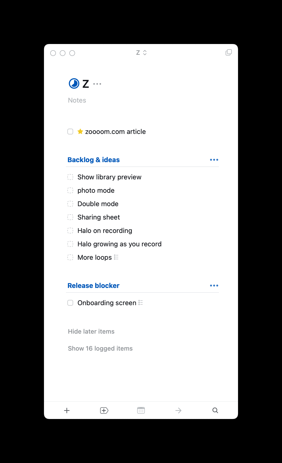
This is my to-do list at the time of writing. I’m struggling to add the halo showed on the video preview in the export (and ideally as an export option). The next most important item is the onboarding, I’m not super excited to work on this, I don’t know why but I have to do it sooner than later.

Summer 2025

Loops on request

The best part of building an app for friends is the requests.

Elisabeth asked for the Law & Order sound. It’s in. My French friends asked for a few loops of their own.

Summer 2025

Selfie mode

Zooom can flip to the front camera now.

Filming yourself zooming in on your own face with a sad saxophone underneath is exactly as ridiculous as it sounds, and that’s the whole point.

Summer 2025

Build (1)

About a month ago, I set out to prototype the revival of an app I loved—one that existed back in the day, back when Instagram had 8 photo filters and no reels.

My main trade is software design, not engineering. I can hard-code HTML/CSS, I understand the basics of React but I know nothing, absolutely nothing about Swift.

For this app, I wanted to build it on my own—for two simple reasons: the complexity of the App seemed relatively low, and I wanted to move quickly while I was still excited about it.

I found in the past that, yes you can go further with the help of friends or others but the effort to coordinate and/or agree on the smallest details take the fun away from these type of side projects.

For this one, fun is the main goal. So over the past few weeks, I’ve spent a couple of hours here and there, dabbling in what the used-to-be cool kids call vibe coding.

A couple of prompts to Cursor, and the app was running locally on my phone. I specifically skipped the step—I’ll focus on the UI later.

For this V1, I just wanted the app to run. Run smoothly, so I could show it as quickly as possible. Right now users can pick between two audio loops and record a video from the back camera.

The recorded video only includes the audio from the loop. If I remember correctly, that wasn’t possible with the original app, maybe due to some technical limitations.

I showed and shared the prototype with a couple of friends—some familiar with the original, some not. So far, the feedback and process have been nothing but positive. We got some good laughs out of it.
Summer 2025

Reviving a loved App

In 2017, the New York-based studio This Also released an iOS app called OOO.

OOO let you zoom or un-zoom while recording a video and overlay it with looped music. It had 5 to 6 different “themes” and was super simple to use. Press and move up or down on your screen to record and control the zoom; release to stop and save the video.

Two examples — the sound is ON:

Why revive it

The first and main reason is selfish: I want to use the app. I’ve been wanting to use it periodically since it was taken off the App Store.

Another reason is that music filters as good as Zooom’s now exist solely on social media apps. Unless you’re recording and publishing through those apps, you don’t get the fun filter.

Minimal start

Start with one music track — likely the same “Sad Saxo” from the examples above — one zoom direction, all while recording a video.

The video should be stored in the user’s photo library, ideally under a separate folder. The interface can be minimal, but we’d need permissions to record and save videos.

If you’re interested…

I’m going to start building the first version in the next few weeks. I’m not even sure I’ll end up publishing it, and if I do, it’ll probably be free or cost less than $2.

Spring 2025

A Minimal homescreen

For the last few weeks, I’ve been trying different apps that would turn my phone into something closer to the minimalist Light Phone.

I tried a few: Blank, Dumb Phone, and Smile App Launcher—the latter being the one I stuck with the most. Yet, despite their best efforts, launching an app wasn’t the smoothest experience.

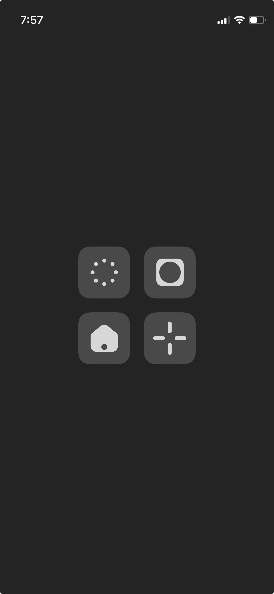
So I went back to a more integrated and simple solution using the Shortcuts app and custom icons.

alt text

I only kept my most important apps: Camera, Homecam, Safari and Messages (Clockwise)

I also kept the minimal and uniform initial design, but to differentiate each app, I chose shapes that I associate with each one.

It’s been a week since I made the change, and I’m still happy with it. If you have any questions, feel free to reach out—I’d be happy to help.

Winter 2024

Keyword blurring

Manuel Moreale recently proposed the concept of hiding specific topics.

A similar idea would let users define personal keywords to blur on the browser level. I would, totally randomly, choose to blur terms like AI, Trump, Growth, you get the idea.

Rather than completely removing content, the browser extension would apply a CSS blur filter to the parent block containing specified keywords, making them less visually intrusive.

Fall 2024

alt text

Summer 2024

Type, More Menu(s)

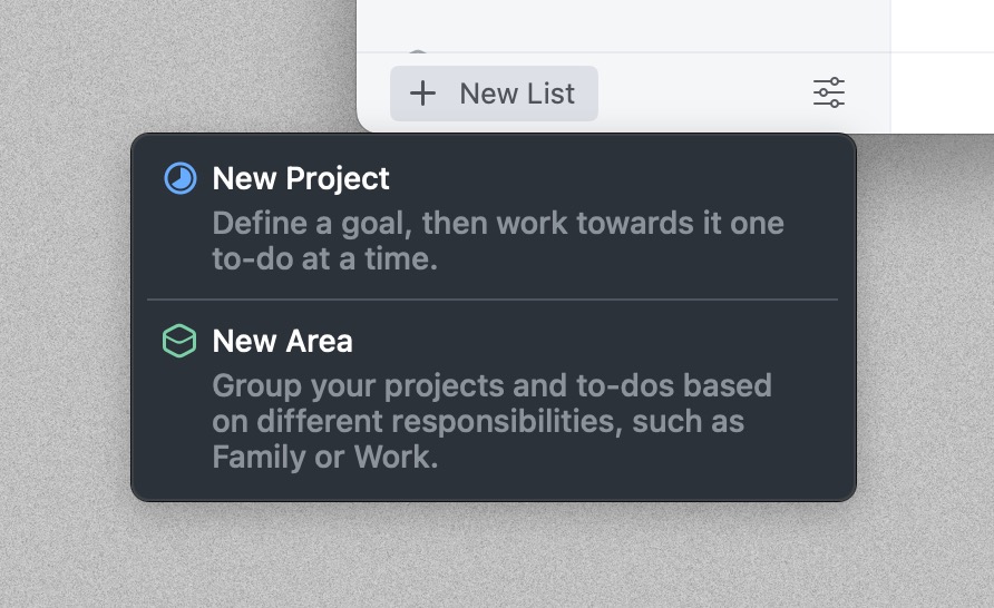
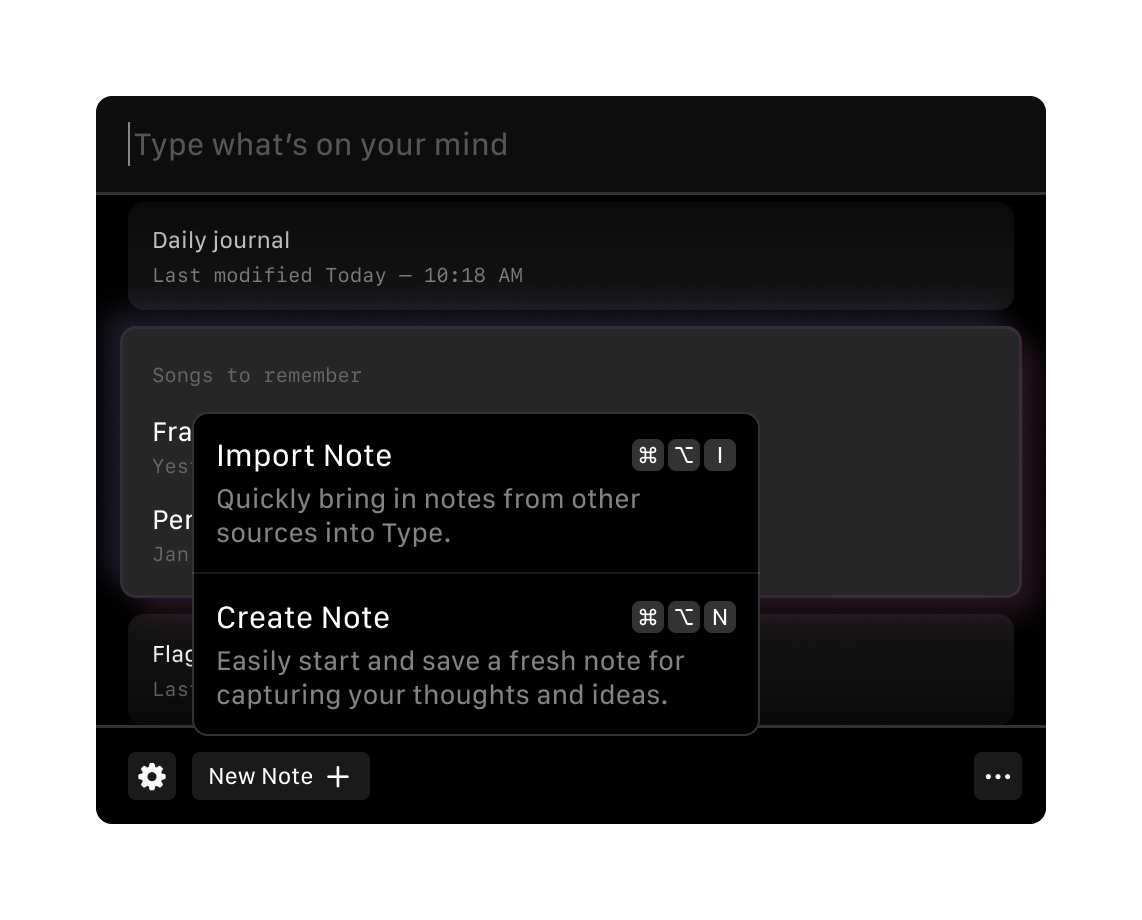
In what could only be described as a shameless love letter to Things’ iconic ”+ New List” button (hey, if you’re going to steal, steal from the best), we added two fresh menu items to Type.

alt text

One for importing notes from other apps – because apparently some people write outside of Type

alt text

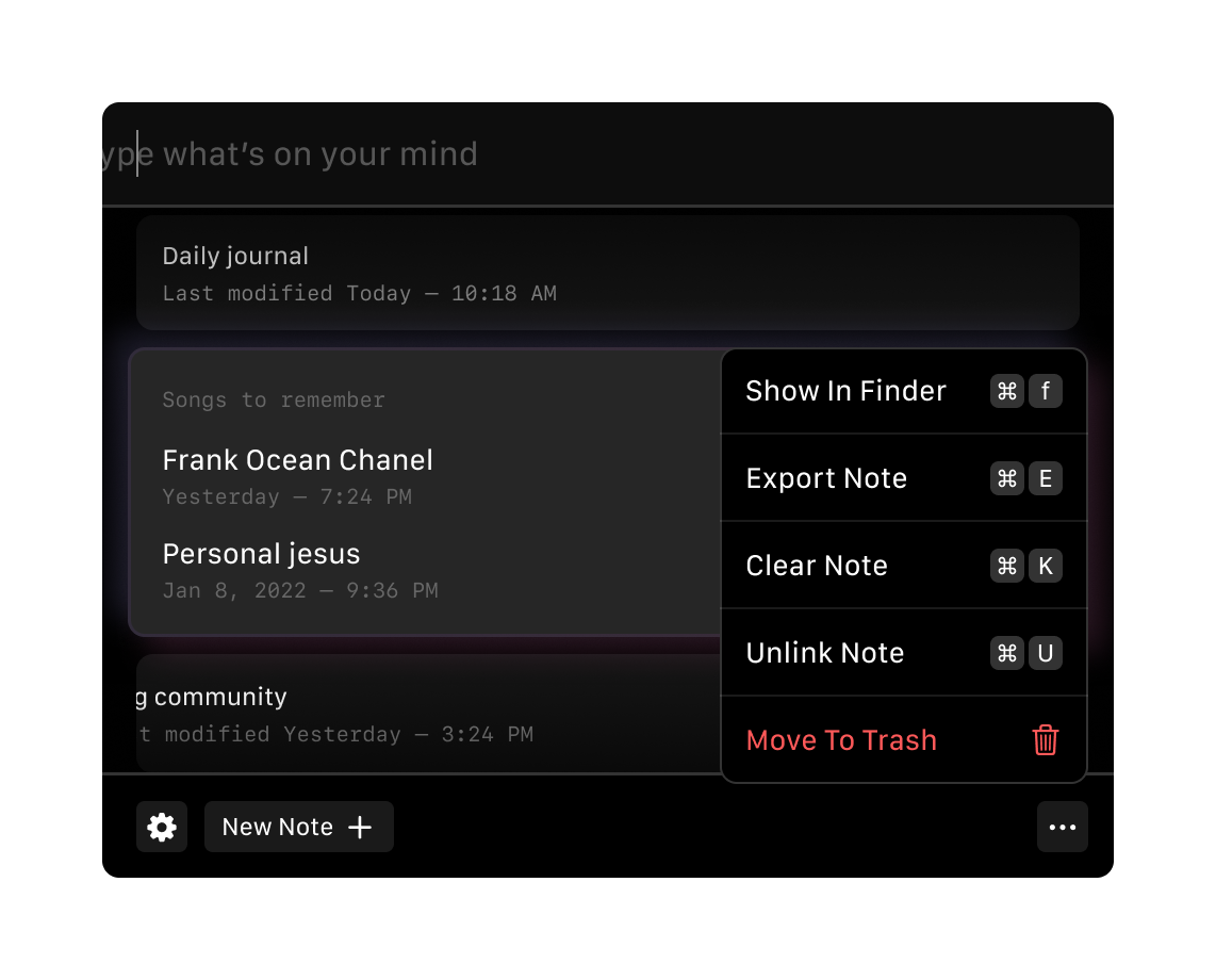
With Type’s limited screen real estate. So naturally, we added a contextual menu for managing notes, rather than cluttering each note item with options.

alt text

And yes, keyboard shortcuts included, because we’re not monsters.

Summer 2024

A Quick Paywall Redesign

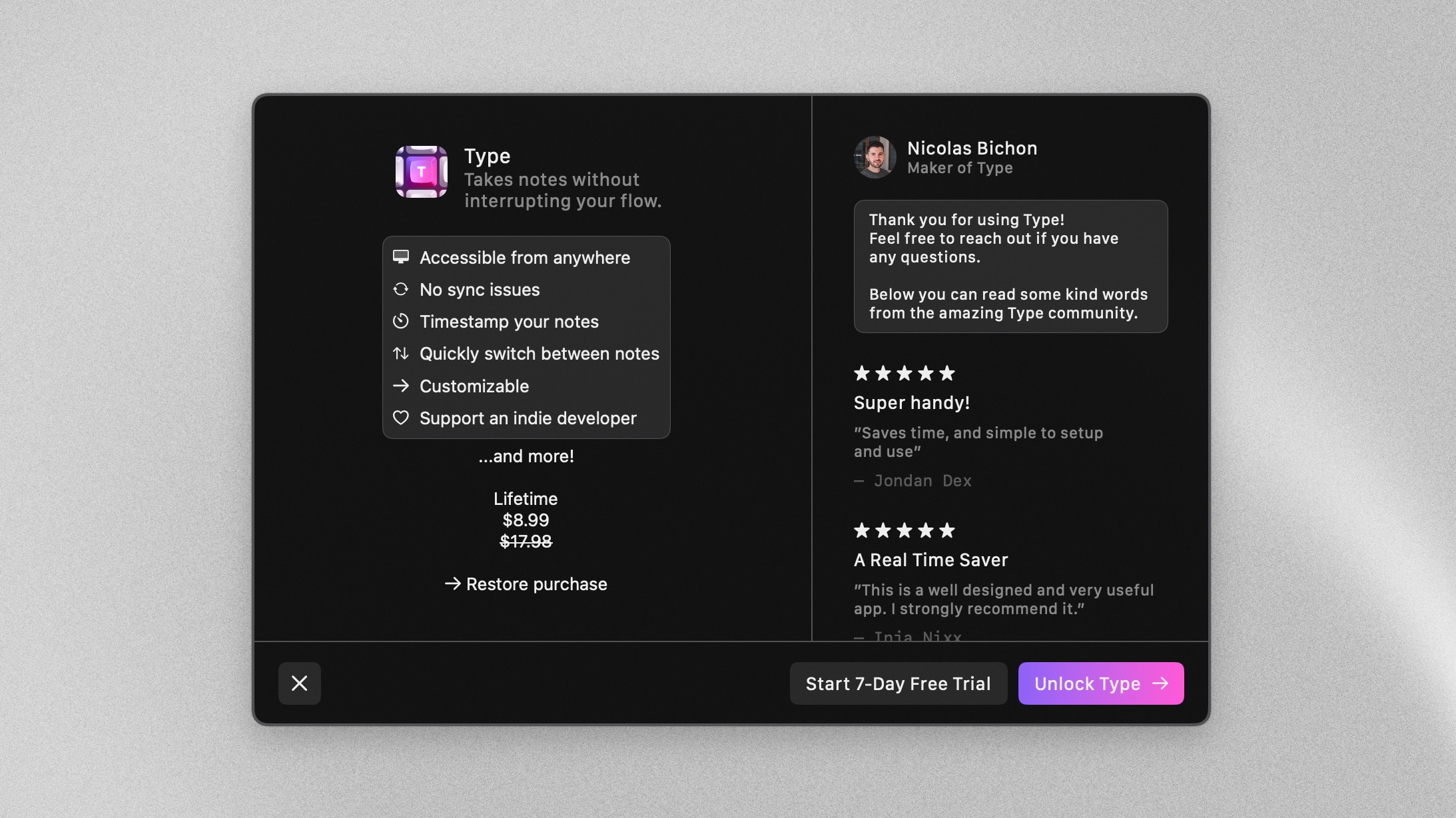
After experimenting with a pay-to-try model, Nicolas was exploring a new paywall design for Type. He had the essentials in place - features, pricing, and basic structure - but wanted to test different approaches.

alt

Nicolas had nailed the essential content structure with clear feature descriptions and pricing. But we saw an opportunity to make it more compelling with some thoughtful tweaks.

alt

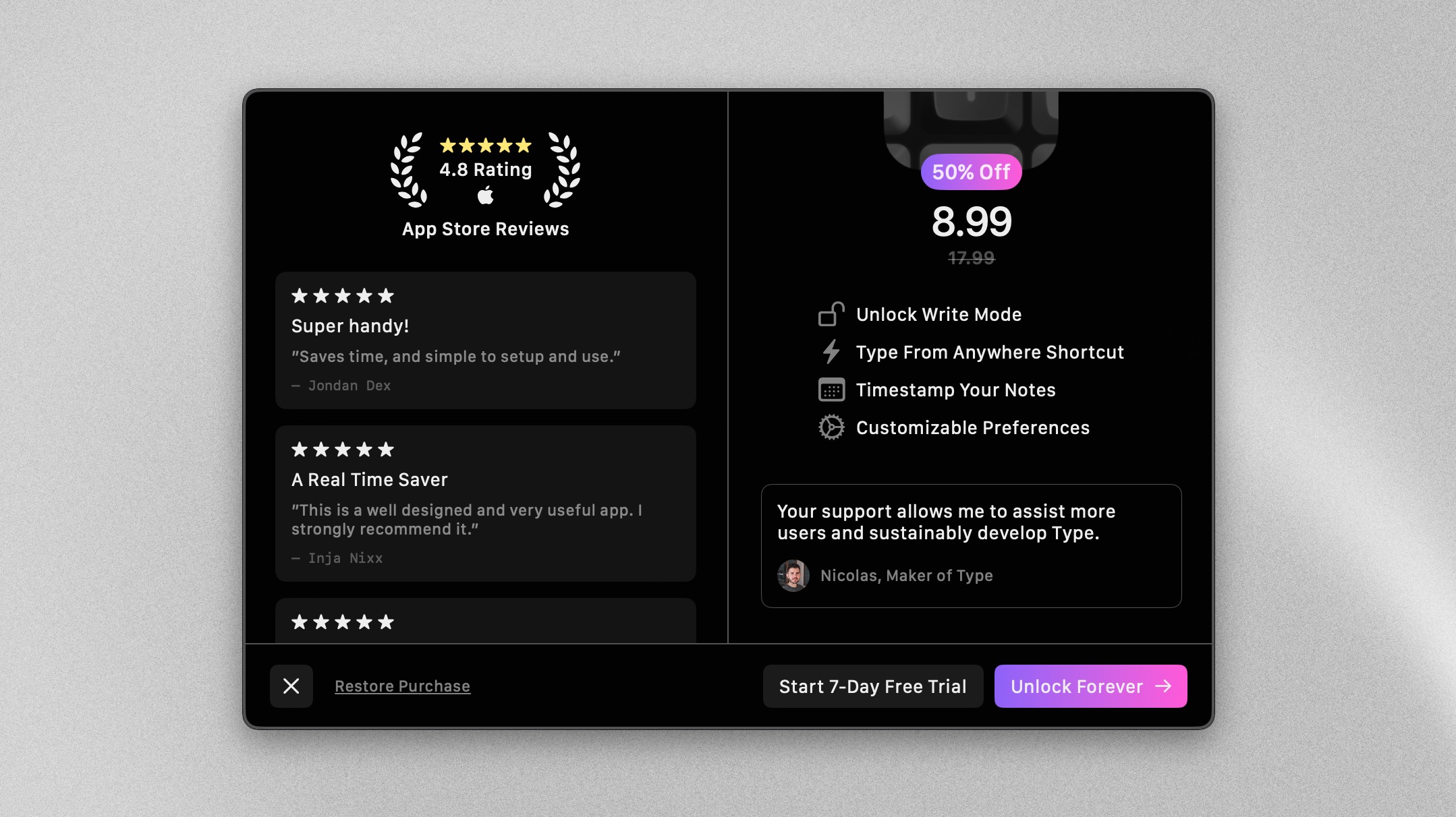
we improved the grouping, added user reviews, refined the visual hierarchy, and introduced a lifetime pricing option.

Make sure to give a try to Type if you haven’t already.