Build (1)
About a month ago, I set out to prototype the revival of an app I loved—one that existed back in the day, back when Instagram had 8 photo filters and no reels.
My main trade is software design, not engineering. I can hard-code HTML/CSS, I understand the basics of React but I know nothing, absolutely nothing about Swift.
For this app, I wanted to build it on my own—for two simple reasons: the complexity of the App seemed relatively low, and I wanted to move quickly while I was still excited about it.
I found in the past that, yes you can go further with the help of friends or others but the effort to coordinate and/or agree on the smallest details take the fun away from these type of side projects.
For this one, fun is the main goal. So over the past few weeks, I’ve spent a couple of hours here and there, dabbling in what the used-to-be cool kids call vibe coding.
A couple of prompts to Cursor, and the app was running locally on my phone. I specifically skipped the
For this V1, I just wanted the app to run. Run smoothly, so I could show it as quickly as possible. Right now users can pick between two audio loops and record a video from the back camera.
The recorded video only includes the audio from the loop. If I remember correctly, that wasn’t possible with the original app, maybe due to some technical limitations.
I showed and shared the prototype with a couple of friends—some familiar with the original, some not. So far, the feedback and process have been nothing but positive. We got some good laughs out of it.
Reply by emailReviving a loved App
In 2017, the New York-based studio This Also released an iOS app called OOO.
OOO let you zoom or un-zoom while recording a video and overlay it with looped music. It had 5 to 6 different “themes” and was super simple to use. Press and move up or down on your screen to record and control the zoom; release to stop and save the video.
Two examples — the sound is ON:
Why revive it
The first and main reason is selfish: I want to use the app. I’ve been wanting to use it periodically since it was taken off the App Store.
Another reason is that music filters as good as Zooom’s now exist solely on social media apps. Unless you’re recording and publishing through those apps, you don’t get the fun filter.
Minimal start
Start with one music track — likely the same “Sad Saxo” from the examples above — one zoom direction, all while recording a video.
The video should be stored in the user’s photo library, ideally under a separate folder. The interface can be minimal, but we’d need permissions to record and save videos.
If you’re interested…
I’m going to start building the first version in the next few weeks. I’m not even sure I’ll end up publishing it, and if I do, it’ll probably be free or cost less than $2.
Reply by emailA Minimal homescreen
For the last few weeks, I’ve been trying different apps that would turn my phone into something closer to the minimalist Light Phone.
I tried a few: Blank, Dumb Phone, and Smile App Launcher—the latter being the one I stuck with the most. Yet, despite their best efforts, launching an app wasn’t the smoothest experience.
So I went back to a more integrated and simple solution using the Shortcuts app and custom icons.
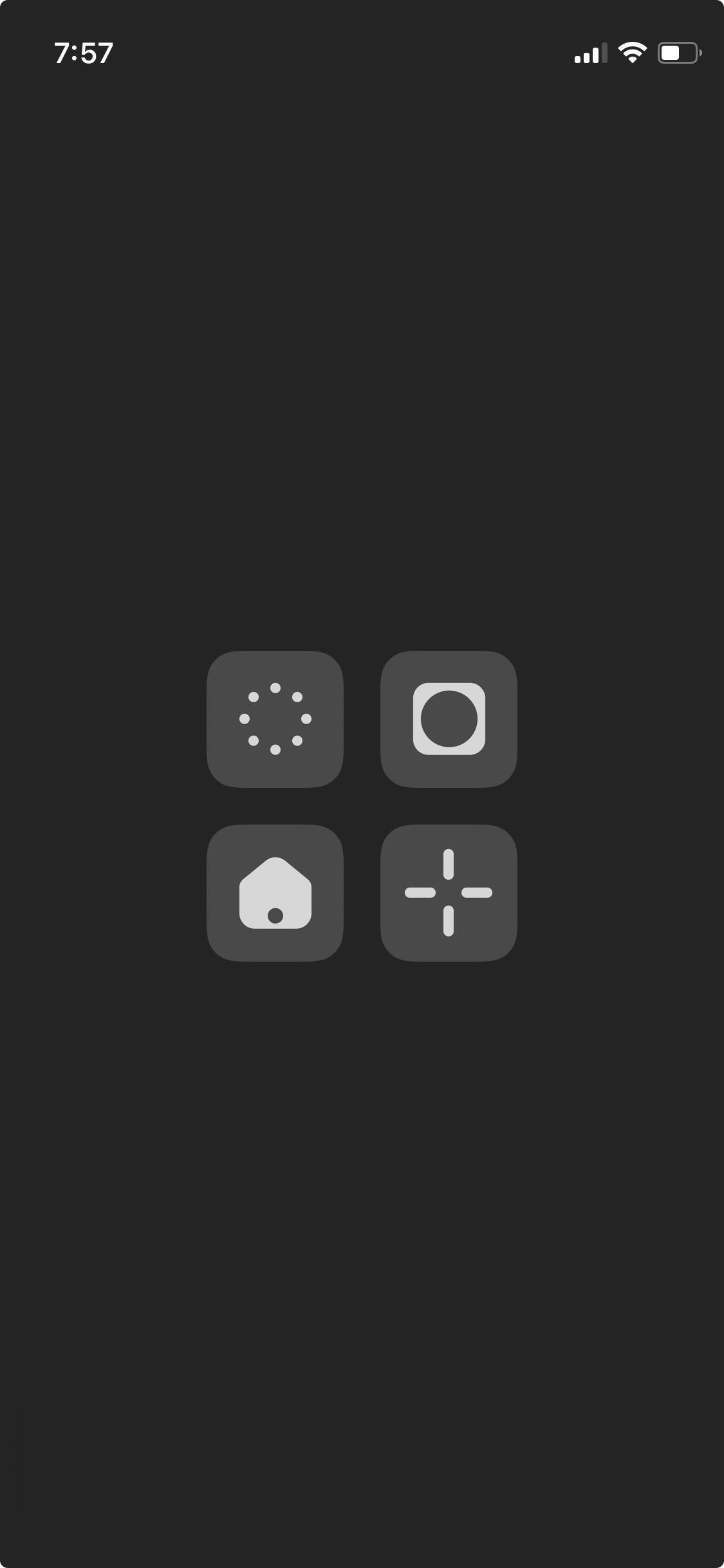
I only kept my most important apps: Camera, Homecam, Safari and Messages (Clockwise)
I also kept the minimal and uniform initial design, but to differentiate each app, I chose shapes that I associate with each one.
It’s been a week since I made the change, and I’m still happy with it. If you have any questions, feel free to reach out—I’d be happy to help.
Reply by emailKeyword blurring
Manuel Moreale recently proposed the concept of hiding specific topics.
A similar idea would let users define personal keywords to blur on the browser level. I would, totally randomly, choose to blur terms like AI, Trump, Growth, you get the idea.
Rather than completely removing content, the browser extension would apply a CSS blur filter to the parent block containing specified keywords, making them less visually intrusive.
Reply by emailType, More Menu(s)
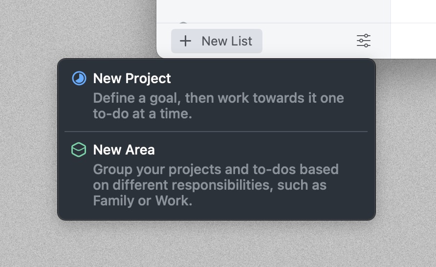
In what could only be described as a shameless love letter to Things’ iconic ”+ New List” button (hey, if you’re going to steal, steal from the best), we added two fresh menu items to Type.
One for importing notes from other apps – because apparently some people write outside of Type
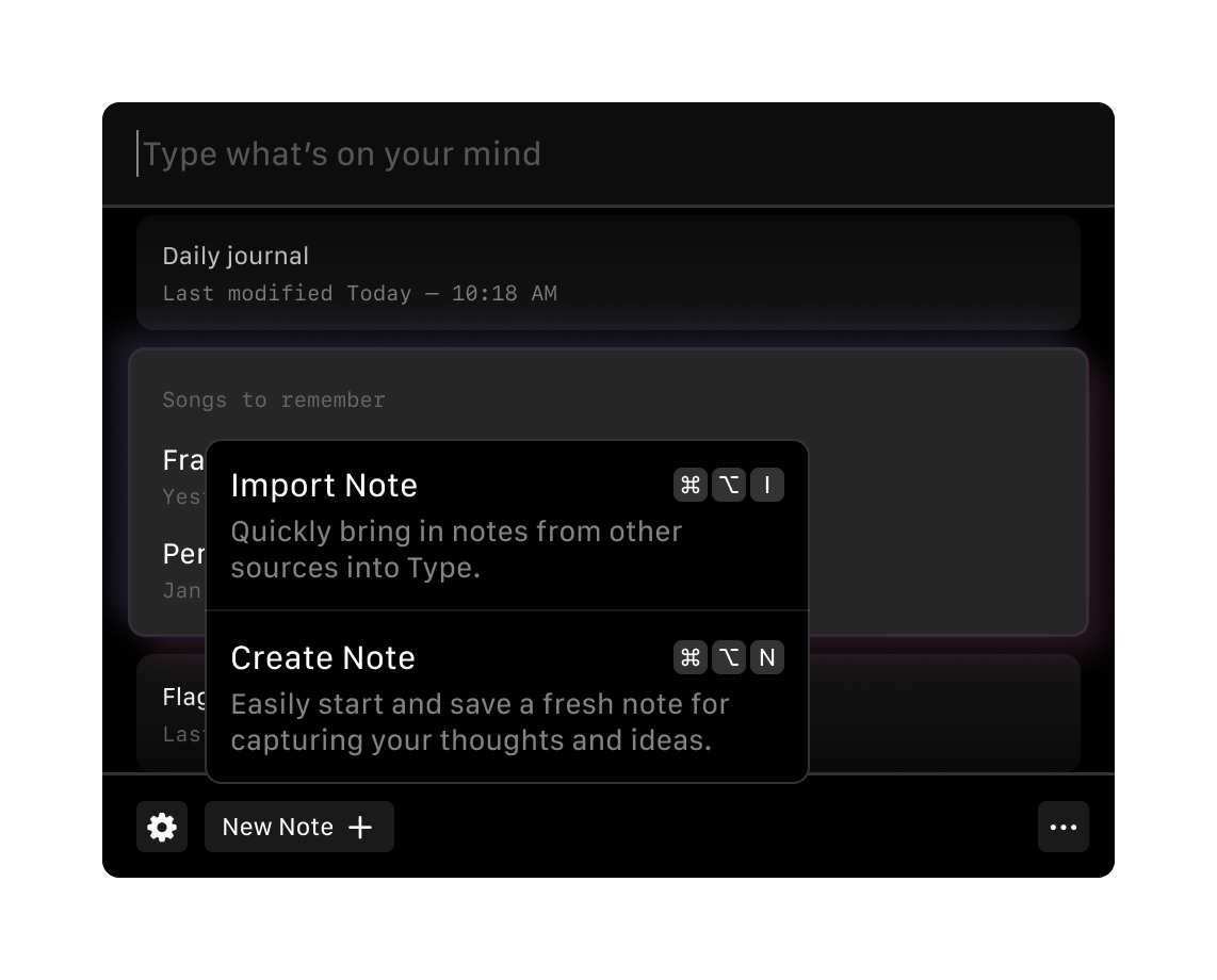
With Type’s limited screen real estate. So naturally, we added a contextual menu for managing notes, rather than cluttering each note item with options.
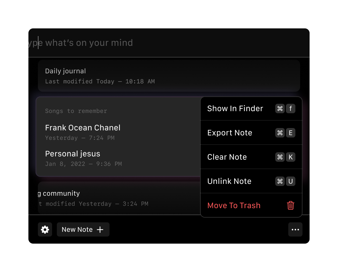
And yes, keyboard shortcuts included, because we’re not monsters.
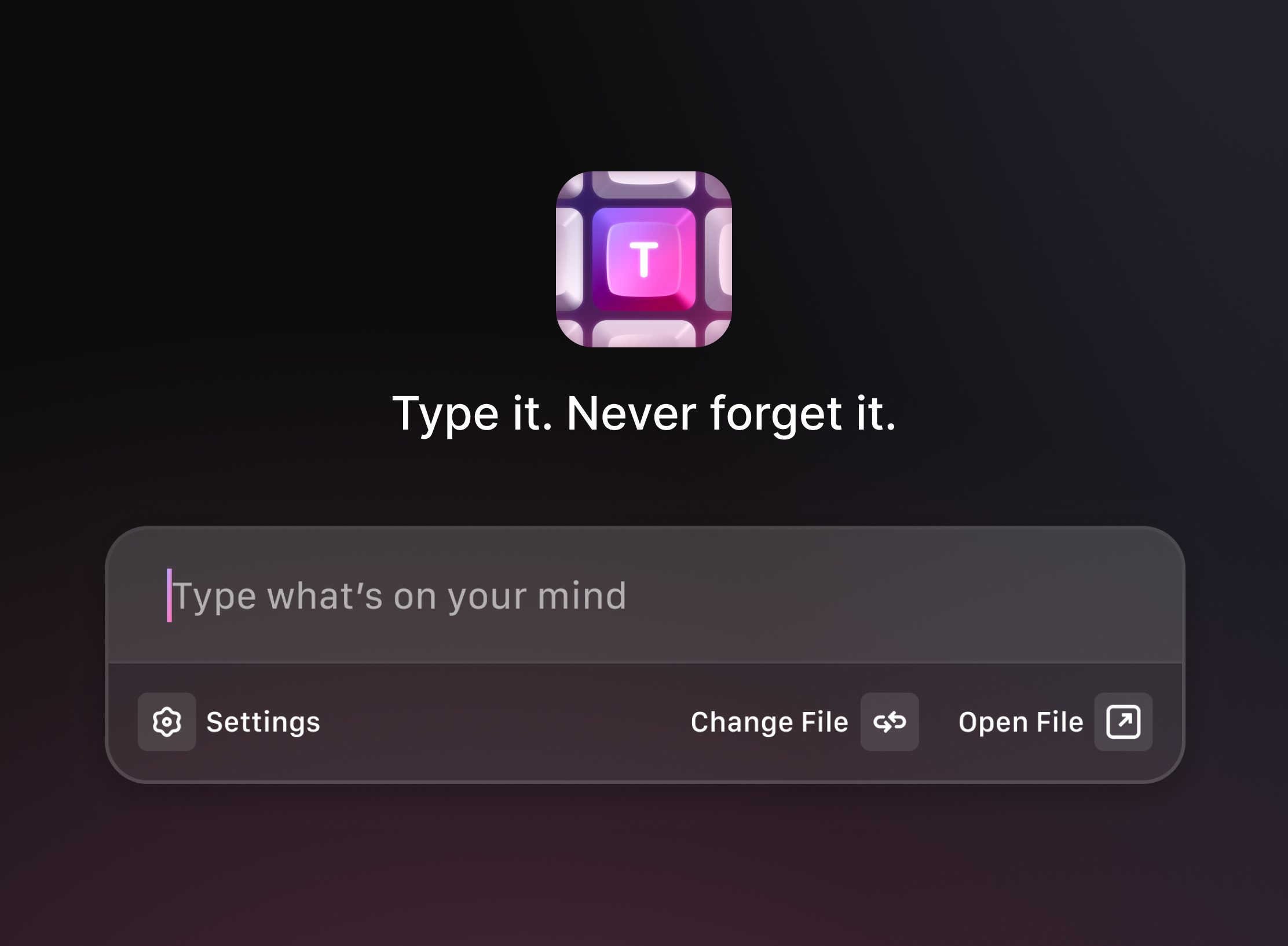
Reply by emailA Quick Paywall Redesign
After experimenting with a pay-to-try model, Nicolas was exploring a new paywall design for Type. He had the essentials in place - features, pricing, and basic structure - but wanted to test different approaches.
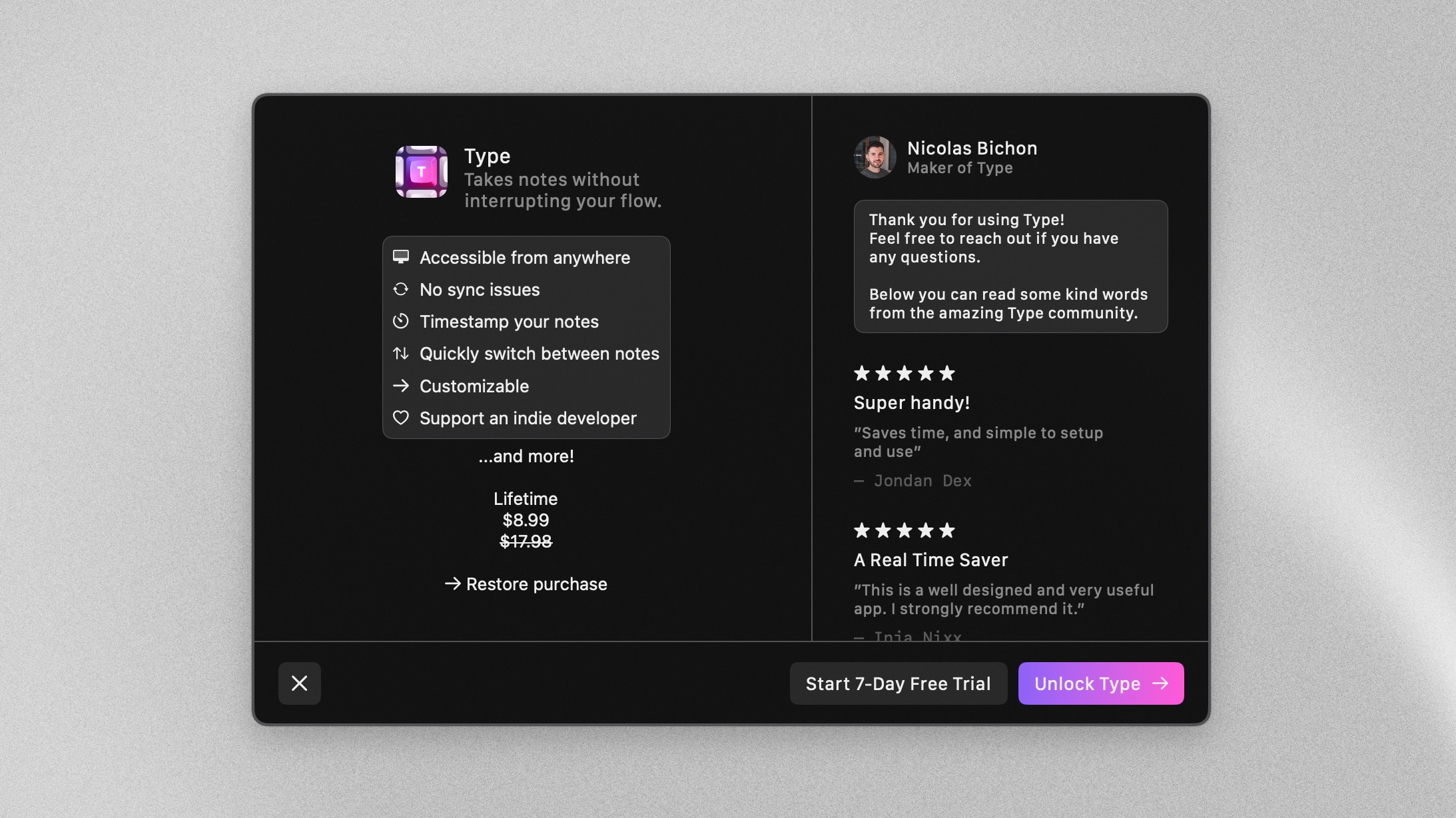
Nicolas had nailed the essential content structure with clear feature descriptions and pricing. But we saw an opportunity to make it more compelling with some thoughtful tweaks.
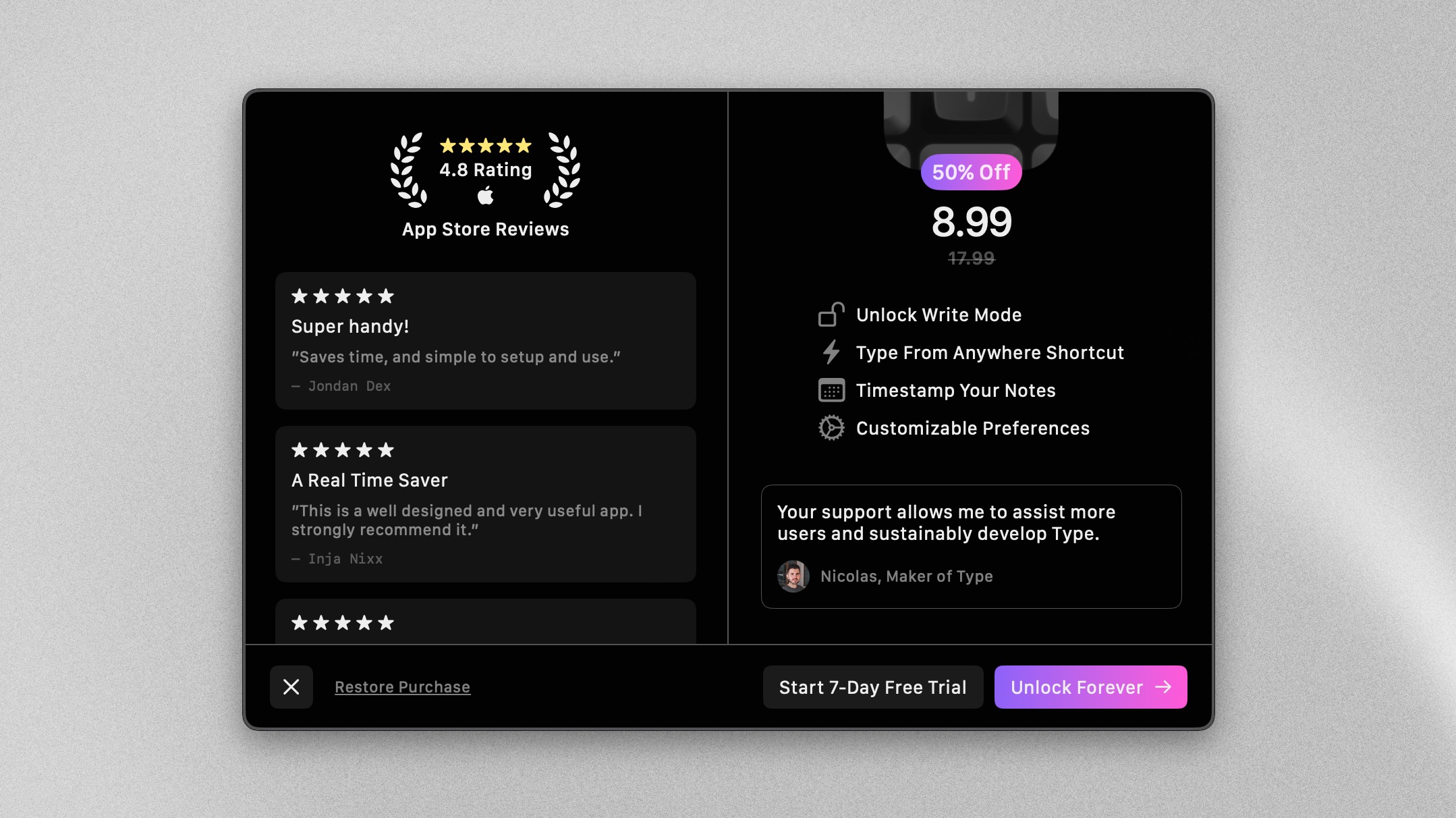
we improved the grouping, added user reviews, refined the visual hierarchy, and introduced a lifetime pricing option.
Make sure to give a try to Type if you haven’t already.
Reply by emailAnatomy of an icon
In late 2022, Nicolas was really getting into his side-projects, Type, a note-taking app for the busy mind. He reached out for some help, and designing an app icon was a fun and different challenge from my day-to-day work. It was something I hadn’t done in a long time.
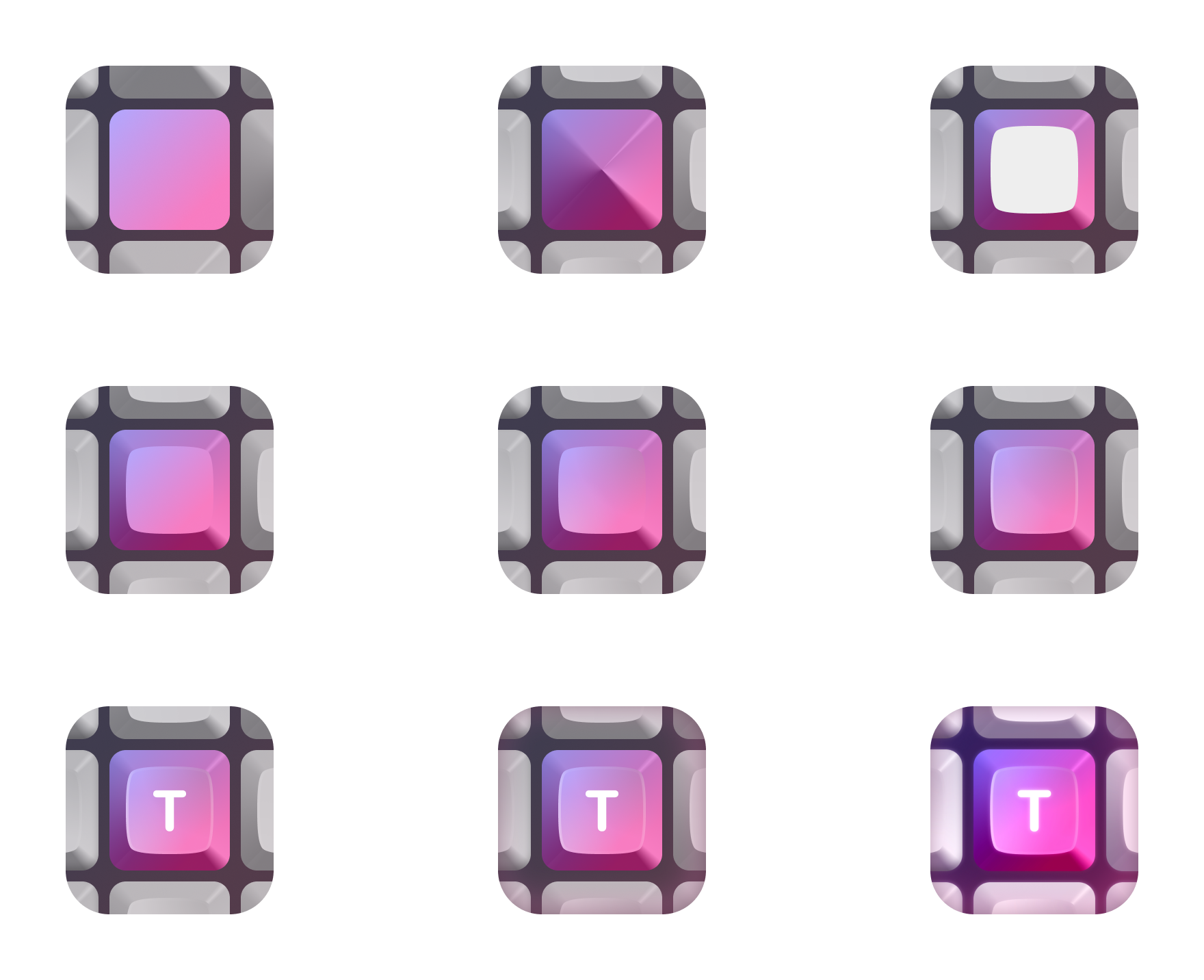
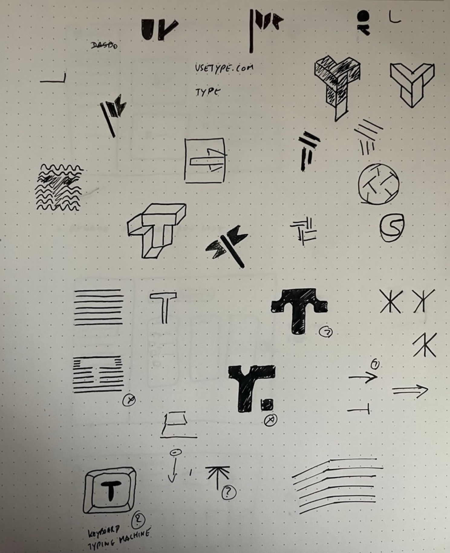
The process was relatively short. Here are most of the steps that led to the final Icon.
Quick sketches
Starting with quick sketches helped us align on the different directions we liked and disliked. Without much doubt, the idea of a keyboard key made more sense than any other idea.
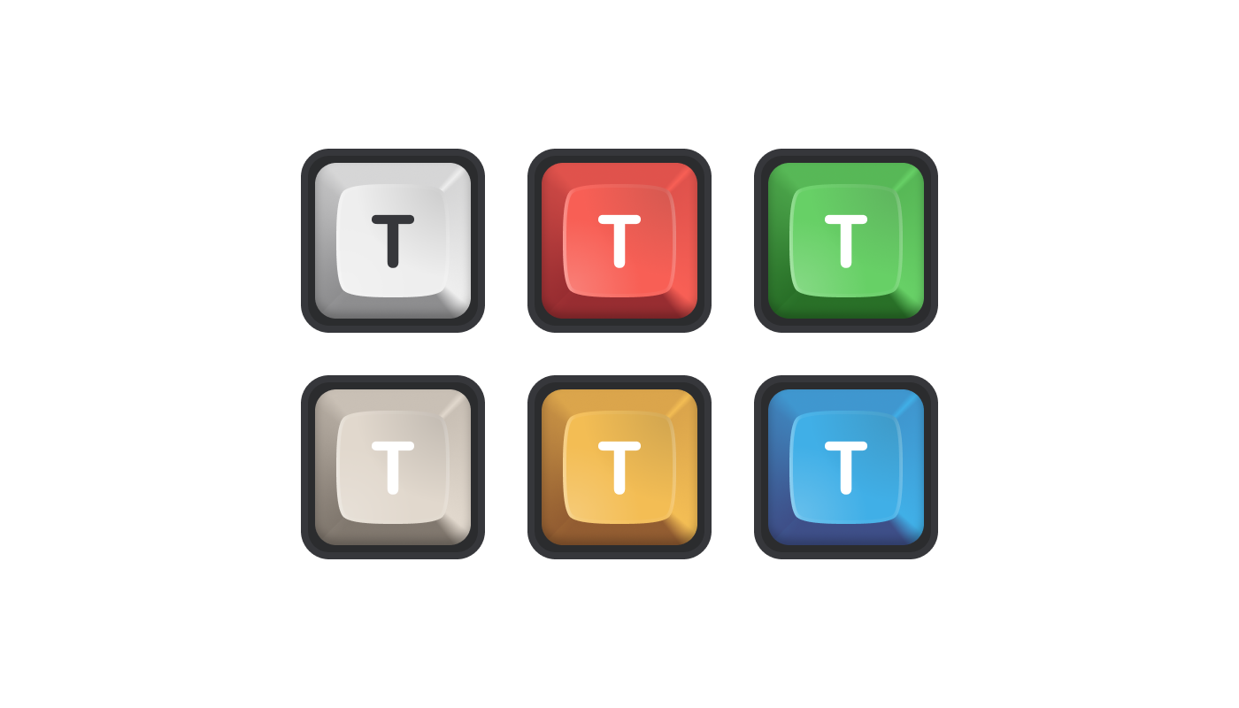
Playing with the key
The first few high-fidelity keys had a retro feel but were kind of bland. I tried a couple of alternatives with tints or combination of more than one key.
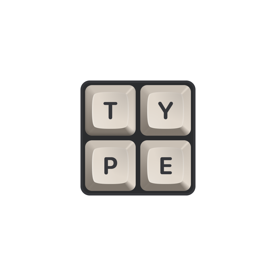
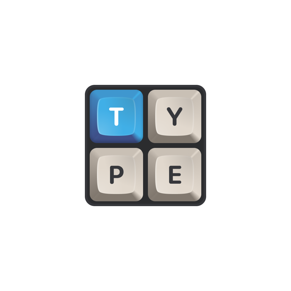
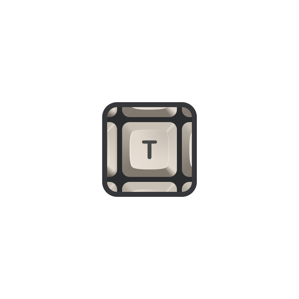
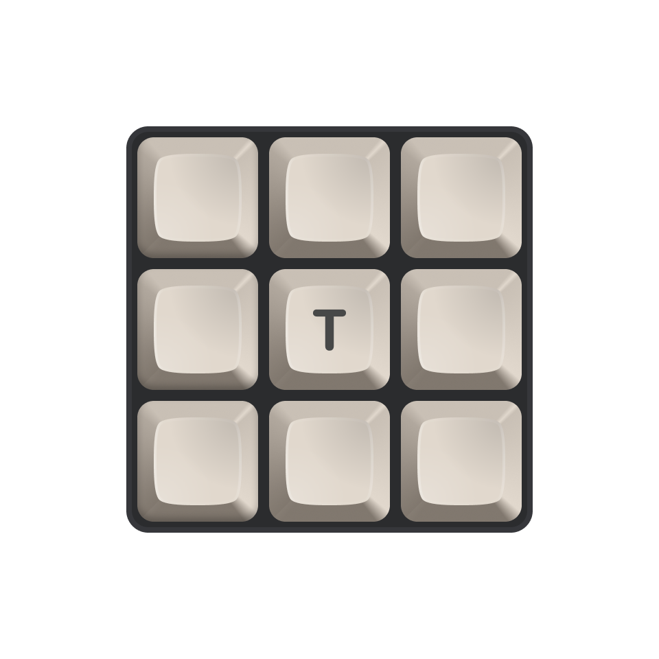
More substance
A key by itself wasn’t strong enough but surrounding the main key with other keys made it feel more “realistic”, keeping the focus on the main key “T” was our final decision.